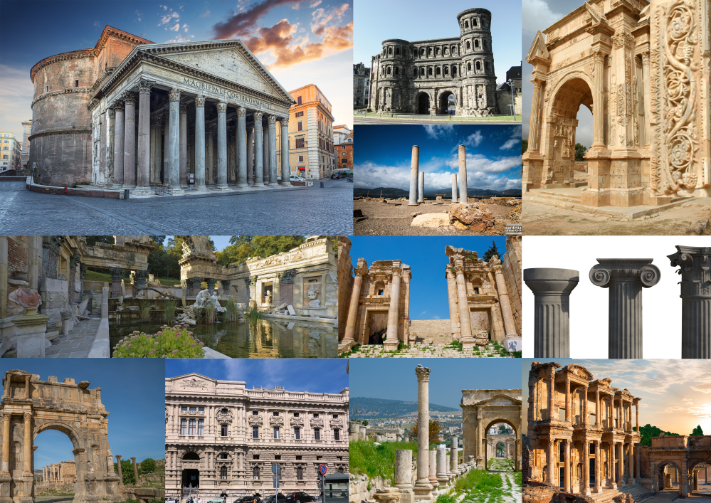
I have created 3 mood boards, two of which cover the steampunk genre, and the other covering the Roman style of architecture.
Me and my project partner discussed the similarities and differences of the steampunk genre and shanty towns.
Similarities
Metal is a very common occurrence in both themes, with shanty towns being made primarily from sheet metal etc.
Both have an industrial theme in some way, though that is more apparent in the steampunk them. This also links into the material point.
They are both fairly densely populated, though shanty towns even more so. Shanty towns are overly populated, whereas steampunk cities are more well designed, and therefore there is less of a population issue.
Both shantytowns and steampunk cities are both very polluted, but the steampunk airborne pollution comes from coal burning etc. The shanty town pollution comes from the lack of hygiene, so their waste is trailing through the streets.
Differences
The steampunk theme features a lot of wealth, focusing mainly on aristocracy. Shanty towns focus on the lower class.
Steampunk cities are smartly planned and built, and look well designed. Shanty towns look extremely rough and poorly built. No design goes into them either, so the contrast is huge.
Crime is very apparent in shanty towns, but the steampunk theme focuses more on high society.
Hygiene is a major problem for those in the shantytowns.
Textures are very important for the project. Metallic textures, rust, rivets, wear and tear/grunge. Cobblestone textures for the streets.
Sketches
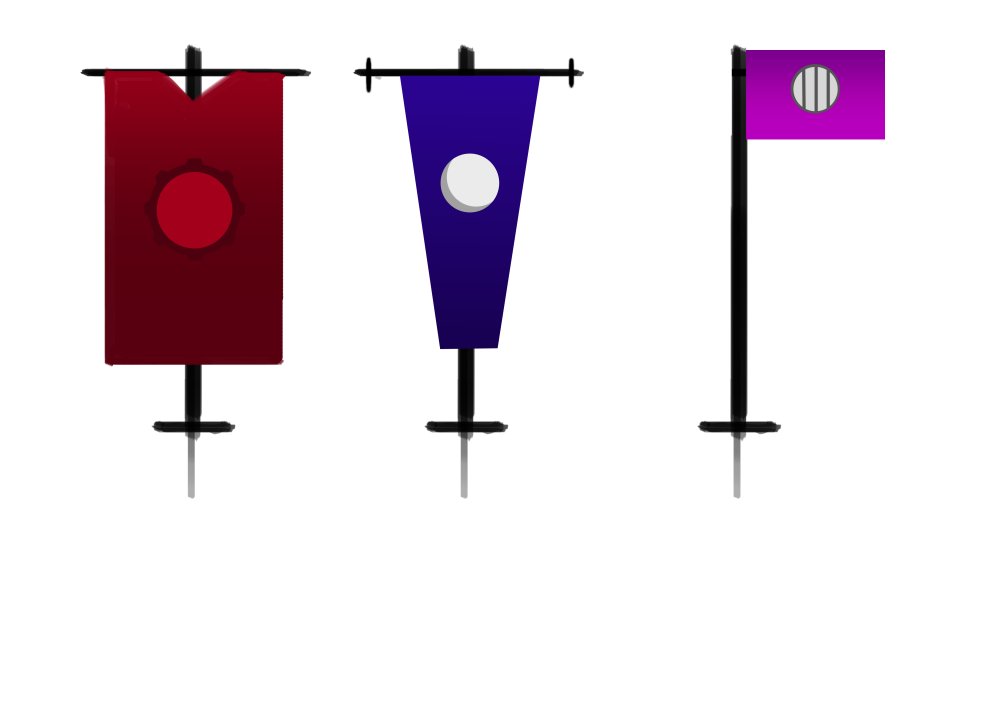 These are my 3 designs for flags. I later chose to create the first one as it fit the theme best, in my opinion.
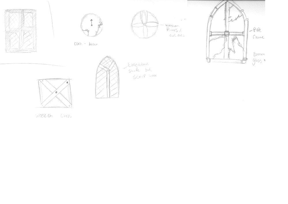
These are the window sketches I made. I decided on the last one, the pipe window, because I feel it combines the victorian style but also incorporates scrap materials, something very important to shantytowns.
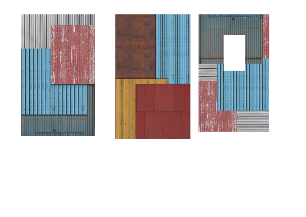
These are my wall concepts. One of the concepts contained a window, but I later scrapped the idea in place of actually creating a window asset
2 point perspective drawing- flag
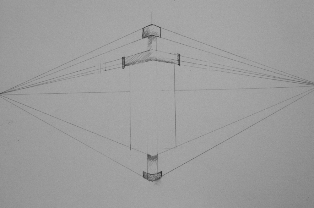
I decided to make a 2 point perspective drawing of my flag as I feel it is the most interesting objects. The other main asset, the wall, is very boring, being a flat plane. The window is also very uninteresting in 2 point perspective.
Final paintings
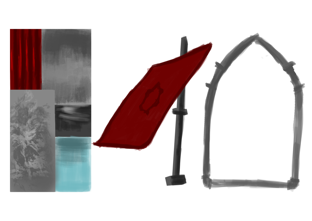
These are the final concepts, painted on photoshop.
Concept artist job role
Concept art is not my strong point, especially individual assets, but it is rather enjoyable, especially compared to texturing. I feel that being able to draw your ideas is a great tool that allows for better creativity in the course, and most likely in the industry.
I really enjoy drawing environments, so I would like to consider doing that in the future although before I do, I need to improve.
